How to design chat widget
Discover how to style your widget’s colors, fonts, and theme to fit your website's branding.
Introduction
This guide will walk you through on how to customize your chat widget to fit your website branding
Look & Feel
To access the look & feel , navigate to your chat widget dedicated page and click on look & feel from the side menu
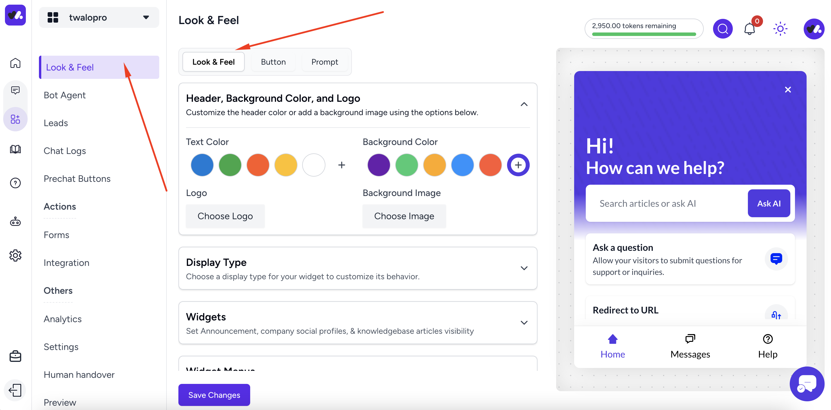
There various options on this page , from header background color, display type, widgets, widget menu , fonts selection e.t.c
Choose a primary color
In the header , background color and logo section, the background color is the primary color, you can also use a background image
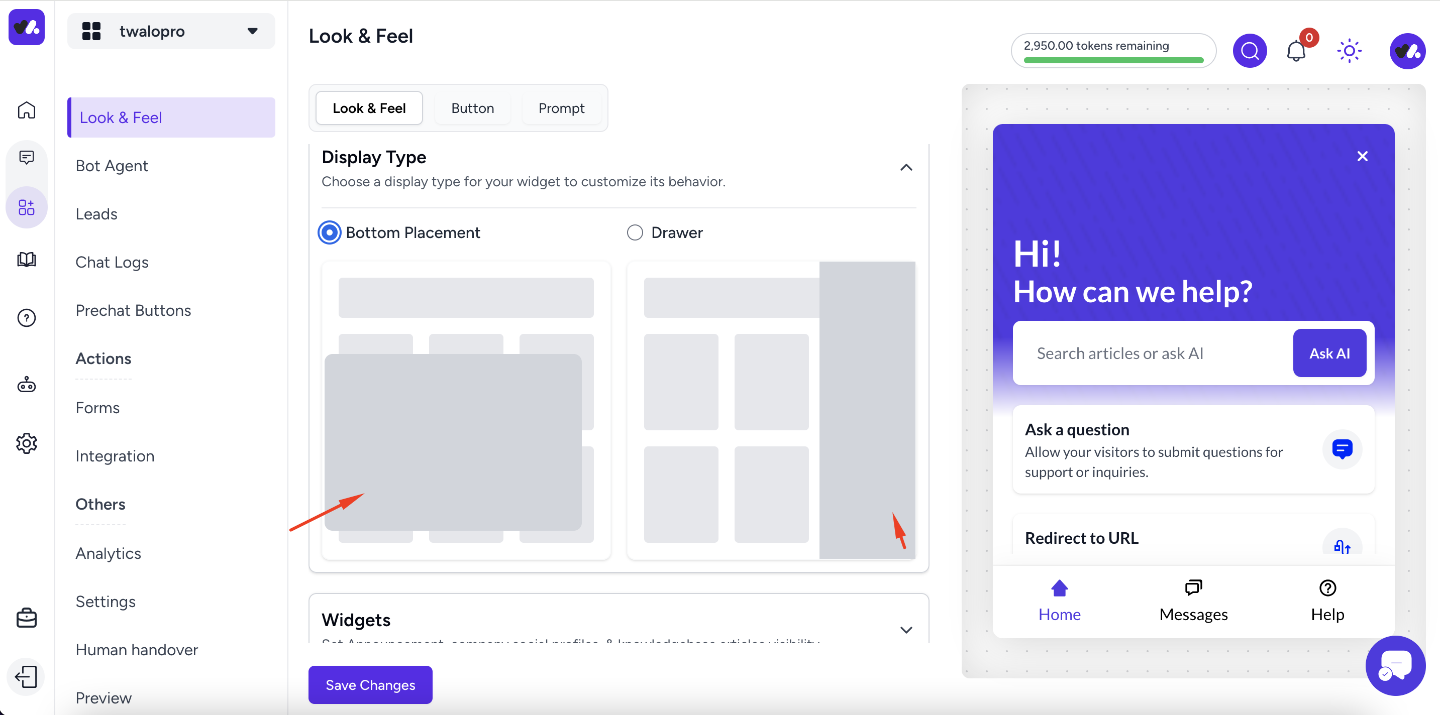
Display type
There are two type of display for your chat widget, the bottom placement and a drawer , this how your chat widget will open on your website, when you select bottom placement , the widget will show as a box from the bottom of your website page and when you choose the drawer option the widget will slide in from the right as show below
Widgets
The widget section is only applicable to the helphub widget type, which are the items that show on the widget home tab
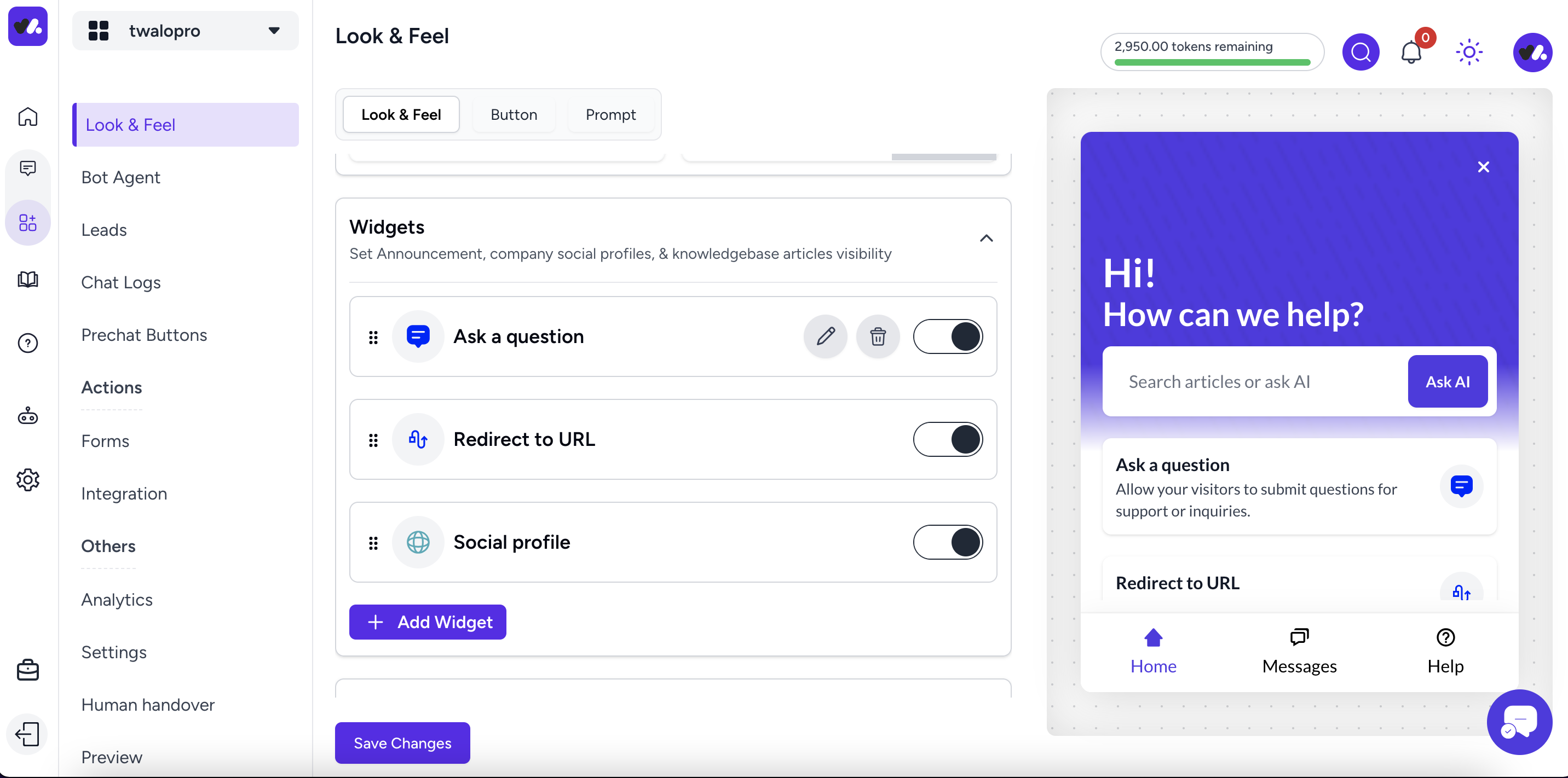
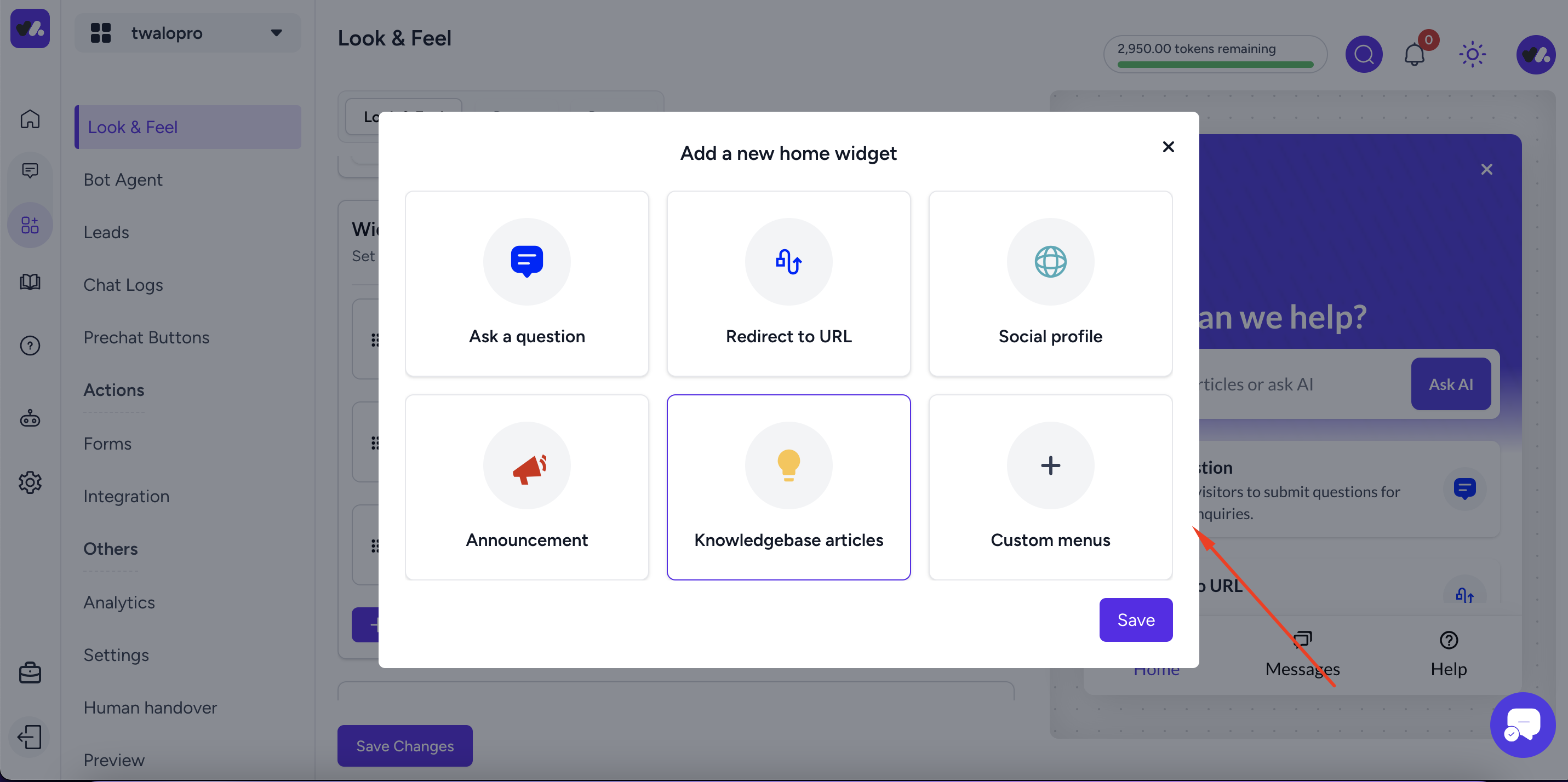
You can add as many items you like, there are different item type you can add , below are some of the item you can add
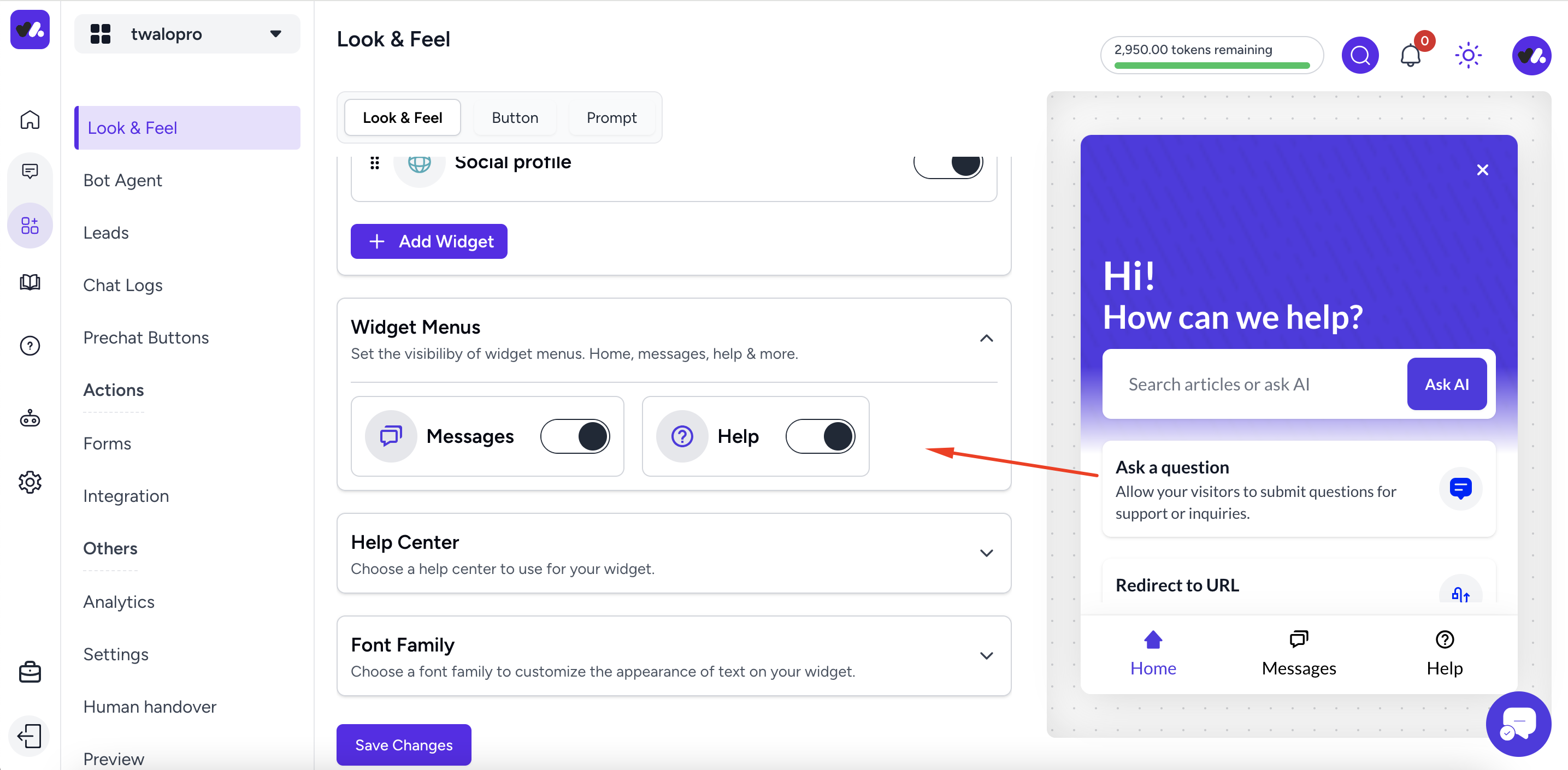
Widget menu
Widget menu is applicable to the help hub widget which are the tabs that show in the widget home, messages, help , here you can enable the ones you want
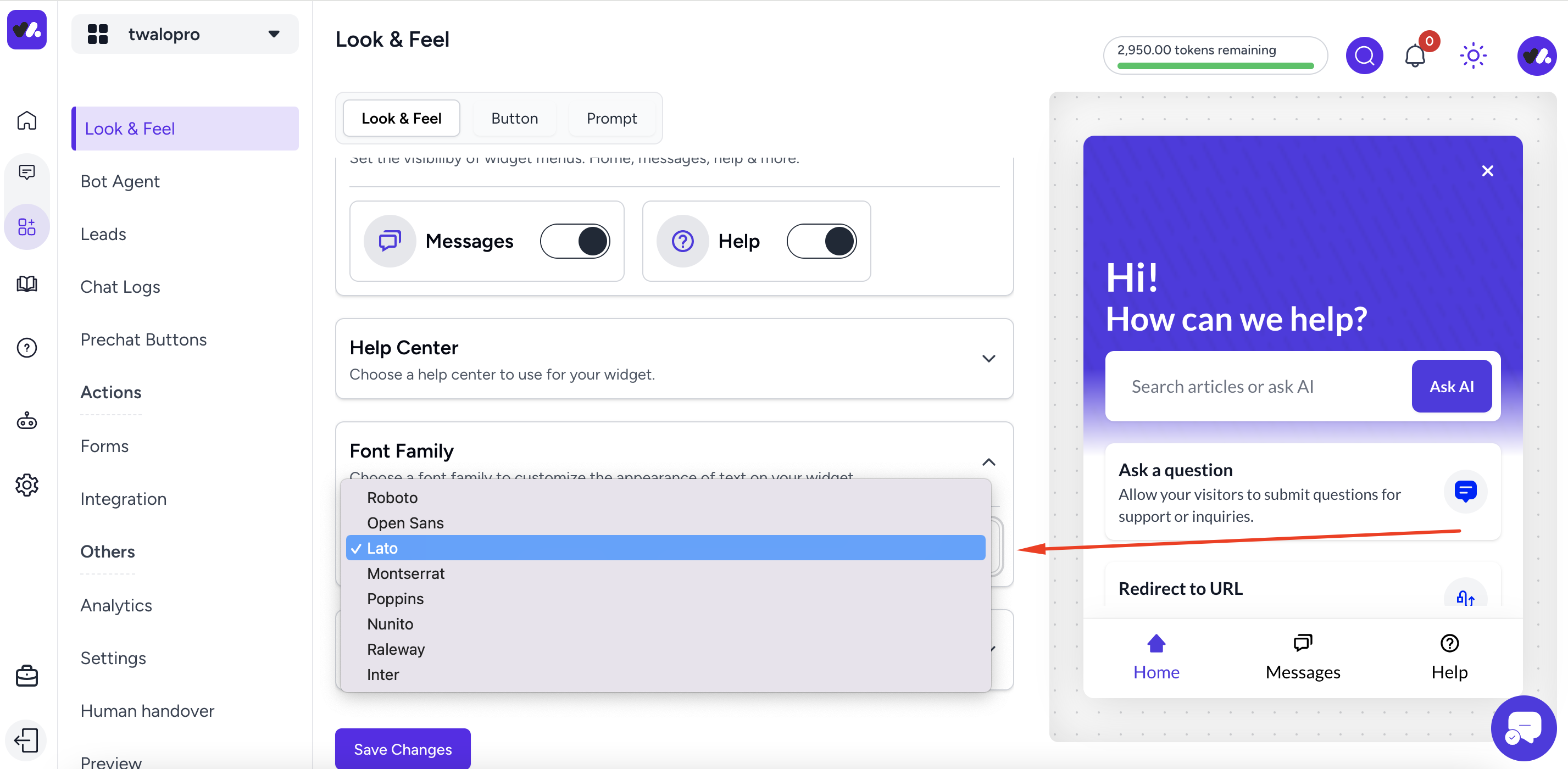
Choose a font family
You can choose a preferred font family as shown below
Did this answer your question?
1 Likes
0 Unlikes