
Analyzing Performance Across Channels (Chats, Help Center, FAQs & News)
How to use the different analytics tabs to evaluate performance across various support channels.
Widgion's Analytics section goes beyond the Overview dashboard. Each support channel has its own dedicated analytics view, giving you a granular look at how visitors are engaging with your chat widget, your Help Center articles, your FAQ widget, and your news releases. To access these, click Analytics in the left sidebar and navigate between the Chats, Help Center, Faqs, and News & Release tabs.
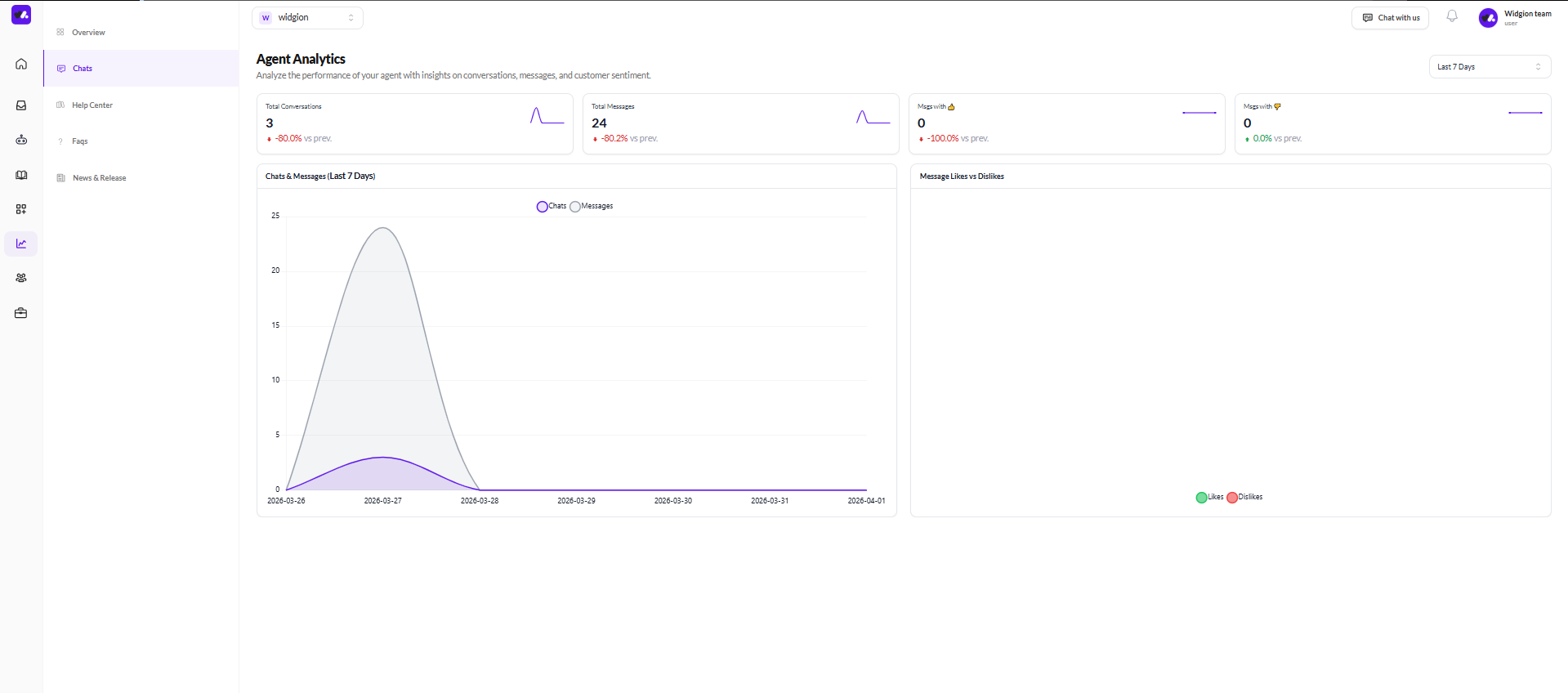
Chats — Agent Analytics
The Chats tab is titled Agent Analytics and focuses specifically on your AI assistant's conversation performance. At the top of the page, four summary cards show Total Conversations, Total Messages, Messages with a thumbs up, and Messages with a thumbs down, each with a percentage change compared to the previous period.
Below the summary cards, the Chats & Messages chart plots both conversations and messages over the selected time range, letting you spot peaks and dips in chat activity. Alongside it, the Message Likes vs Dislikes chart tracks how visitors are rating your assistant's responses over time, with likes and dislikes plotted as separate lines so you can see how sentiment shifts across the period.
 Help Center — Knowledge Base Analytics
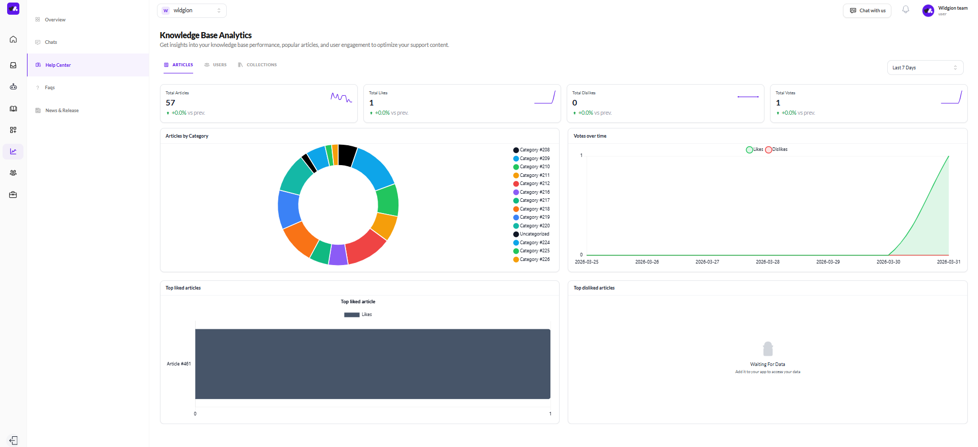
The Help Center tab is titled Knowledge Base Analytics and contains three sub-tabs — Articles, Users, and Collections each offering a different lens on your Help Center's performance.
Articles
The Articles sub-tab shows four summary cards at the top, Total Articles, Total Likes, Total Dislikes, and Total Votes all with period-over-period comparisons. Below that, the Articles by Category donut chart breaks down how your articles are distributed across your collections, giving you a visual sense of where most of your content sits.
The Votes over time chart tracks likes and dislikes on articles across the selected date range. At the bottom, Top liked articles and Top disliked articles bar charts show which specific articles are resonating most with visitors and which ones are falling short.
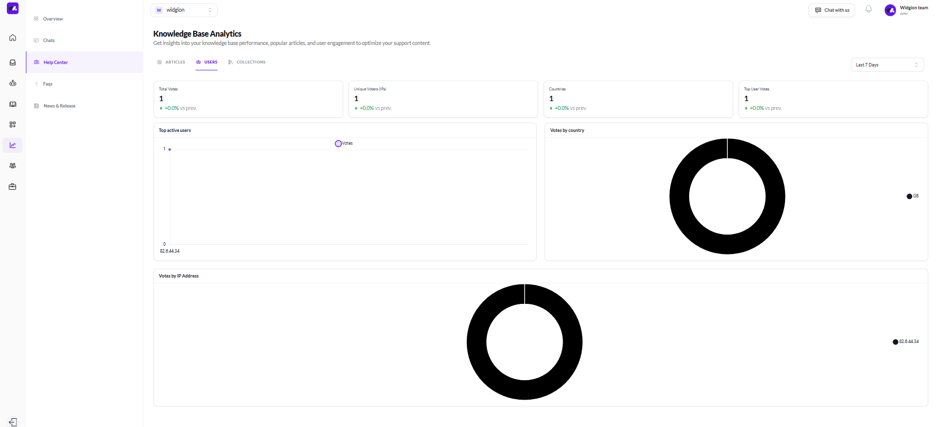
Users
The Users sub-tab focuses on the people engaging with your Help Center. Four summary cards display Total Votes, Unique Voters by IP address, Countries, and Top User Votes.
The Top active users chart shows which visitor IP addresses have been most engaged, while the Votes by country and Votes by IP Address donut charts break down engagement geographically and by individual visitor, helping you understand where your most active readers are coming from.
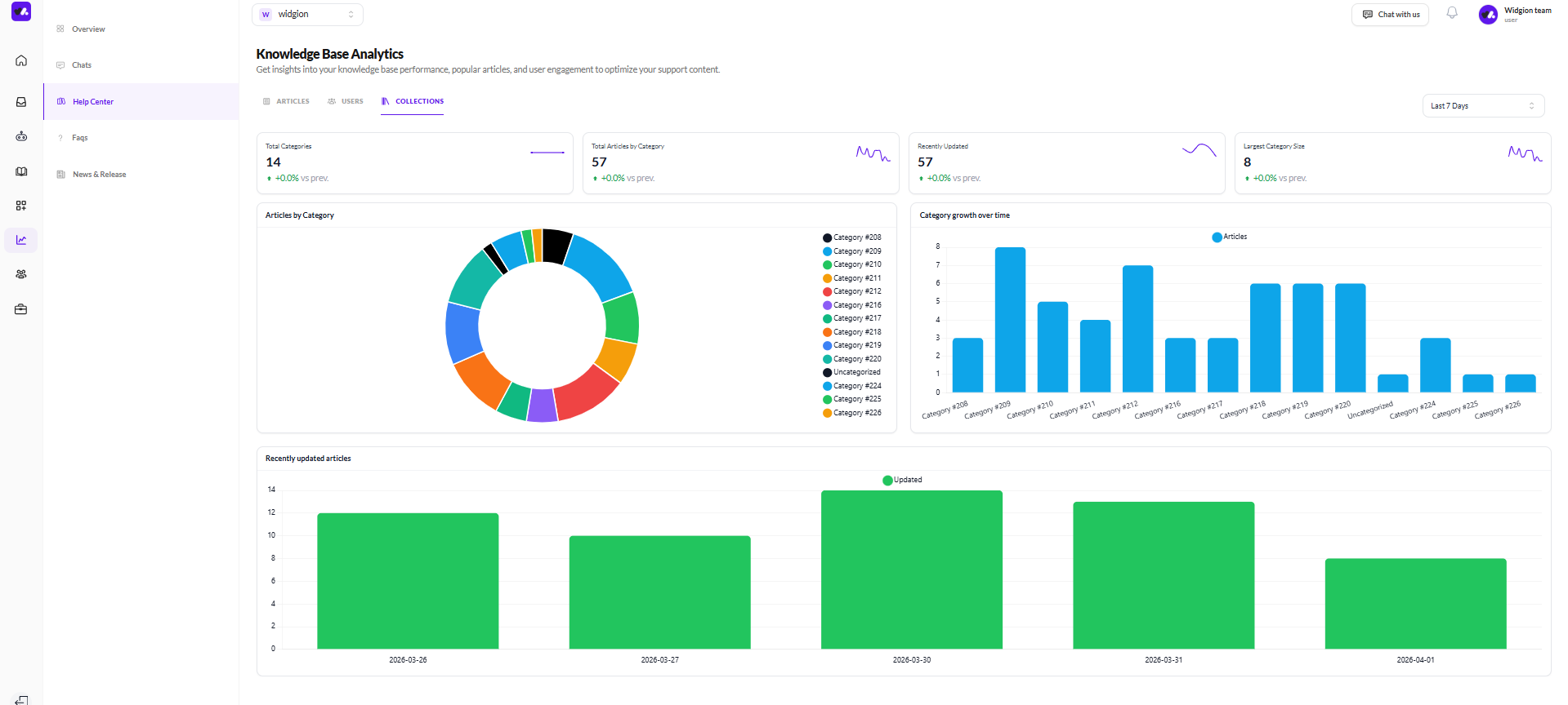
Collections
The Collections sub-tab gives you a structural view of your knowledge base performance. The four summary cards show Total Categories, Total Articles by Category, Recently Updated, and Largest Category Size.
The Articles by Category donut chart shows how content is distributed across your collections, while the Category growth over time bar chart tracks how article counts have changed per category over the selected period. The Recently updated articles chart at the bottom plots update activity over time, showing when articles were last edited and how frequently your knowledge base is being maintained.
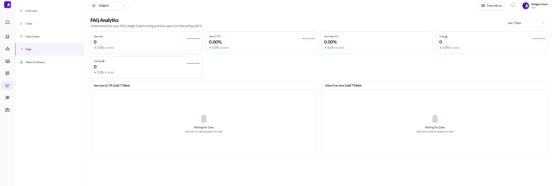
FAQs — FAQ Analytics
The FAQs tab is titled FAQ Analytics and tracks how visitors are interacting with your FAQ widget. Five summary cards show Searches, Search CTR, Zero-Result %, Likes, and Dislikes, each with period comparisons.
The Searches & CTR chart plots search volume and click-through rate over time, showing how often visitors are searching and how often those searches lead to a result being clicked. The Votes Over Time chart tracks how visitors are rating FAQ content across the selected period.
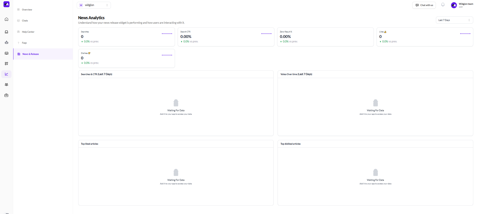
News & Release — News Analytics
The News & Release tab is titled News Analytics and mirrors the structure of the FAQ analytics page. Five summary cards cover Searches, Search CTR, Zero-Result %, Likes, and Dislikes. The Searches & CTR chart tracks how visitors are finding and engaging with your news releases over time, while Votes Over Time shows how content is being rated.
At the bottom, Top liked articles and Top disliked articles sections surface which specific news releases are generating the most positive and negative responses from visitors.
One Platform, Many Signals
Each analytics tab tells a different part of the same story, how visitors are finding, using, and responding to your support content across every channel. Reviewing these tabs together gives you a complete picture of where your support experience is working well and where there's room to improve.
Did this answer your question?
0 Likes
0 Unlikes