
Optimizing Widget Experience and User Interaction
Discover how to configure and position your widget for better visibility and usability.
The way your chat widget looks and behaves on your website has a direct impact on whether visitors use it. A widget that's hard to find, poorly positioned, or visually out of place will be ignored, even if the AI behind it is excellent. Getting the experience right means thinking about your widget from the visitor's perspective before they ever click on it.
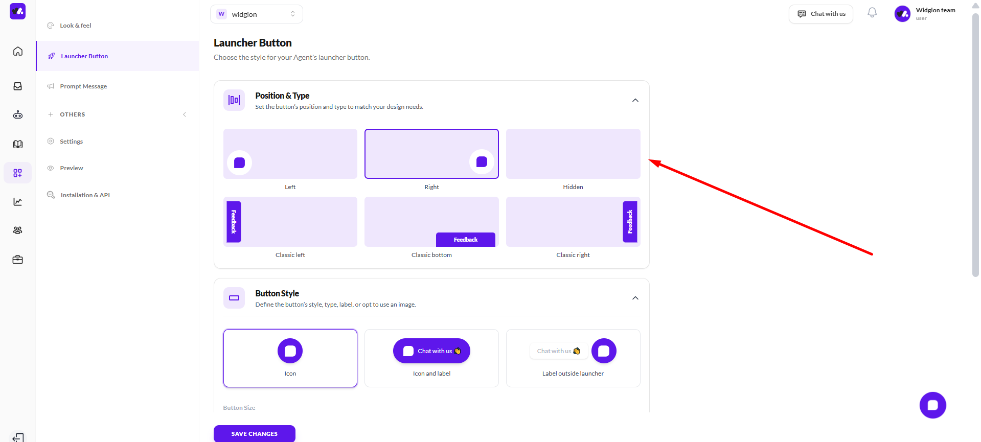
Position It Where Visitors Expect It
Most visitors instinctively look for a chat widget in the bottom right corner of a page. Widgion gives you several position options — Left, Right, Hidden, Classic Left, Classic Bottom, and Classic Right — and while there's no universal rule, defaulting to a position your visitors are already familiar with reduces the friction to starting a conversation.
If your website has elements in the bottom right that conflict with the widget, bottom left or a classic style can work just as well. Hidden is best reserved for cases where you want to trigger the widget programmatically rather than have it visible by default.
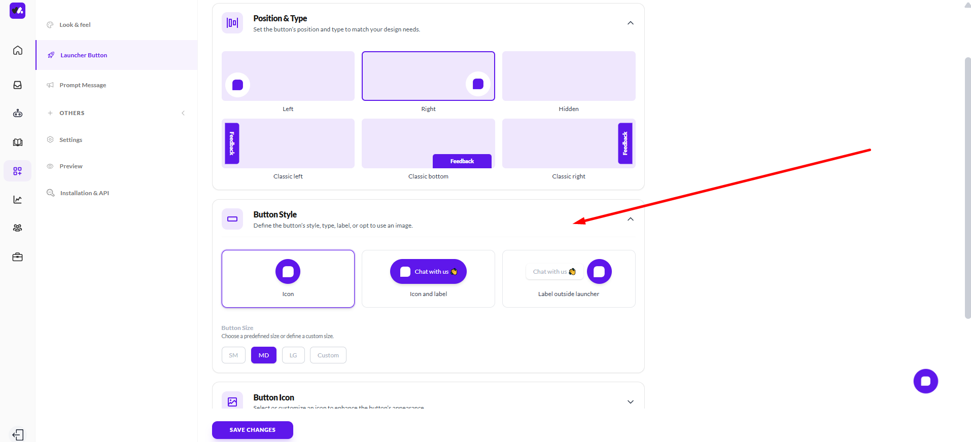
Choose a Button Style That Fits Your Brand
Widgion offers three button styles; Icon only, Icon and label, and Label outside launcher. For most websites, an icon with a label performs better than an icon alone because it removes any ambiguity about what the button does.
Visitors don't have to guess, they can see immediately that it's a chat. Choose the style that feels natural within your site's design, and size it appropriately using the SM, MD, LG, or Custom size options so it's visible without being intrusive.
Use Animation Intentionally
Button animations Static, Breathing, Zoom, and Beam can draw attention to your widget without being disruptive. A subtle breathing or beam animation is often enough to catch a visitor's eye on their first visit without feeling aggressive. Static works best for brands that prefer a more restrained, professional aesthetic.
Avoid animations that feel too flashy for your brand, the goal is to invite engagement, not distract from your content.
Fine-Tune Spacing for a Polished Placement
Use the Button Spacing settings to adjust the horizontal and vertical positioning of your widget so it sits cleanly within your page layout without overlapping important UI elements like cookie banners, footers, or navigation bars.
A widget that covers something else on the page creates a poor experience and may cause visitors to dismiss it entirely.
Think Beyond the Button
A well-configured widget is only the starting point. The interaction that follows the greeting message, the tone of your AI prompt, the speed of responses, all contribute to how visitors experience your widget. Make sure the visual impression the launcher creates is matched by the quality of the conversation it opens. A polished button that leads to a poorly configured assistant will lose trust quickly.
Did this answer your question?
0 Likes
0 Unlikes