
Customizing Chat Appearance
Learn how to adjust colors, launcher icons, themes, and positioning to match your brand.
Widgion allows you to control how your chat appears and behaves across your website. Each setting within the Customize section focuses on a specific part of the experience, allowing you to adjust layout, interactions, and visual presentation in a clear and controlled way.
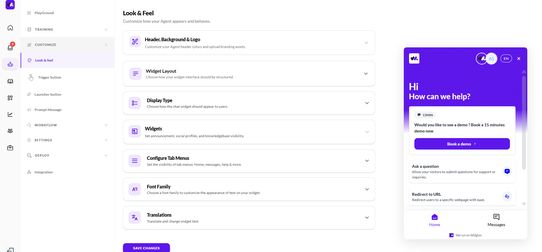
Look & Feel
The Look & Feel section controls the overall visual appearance of your chat widget.
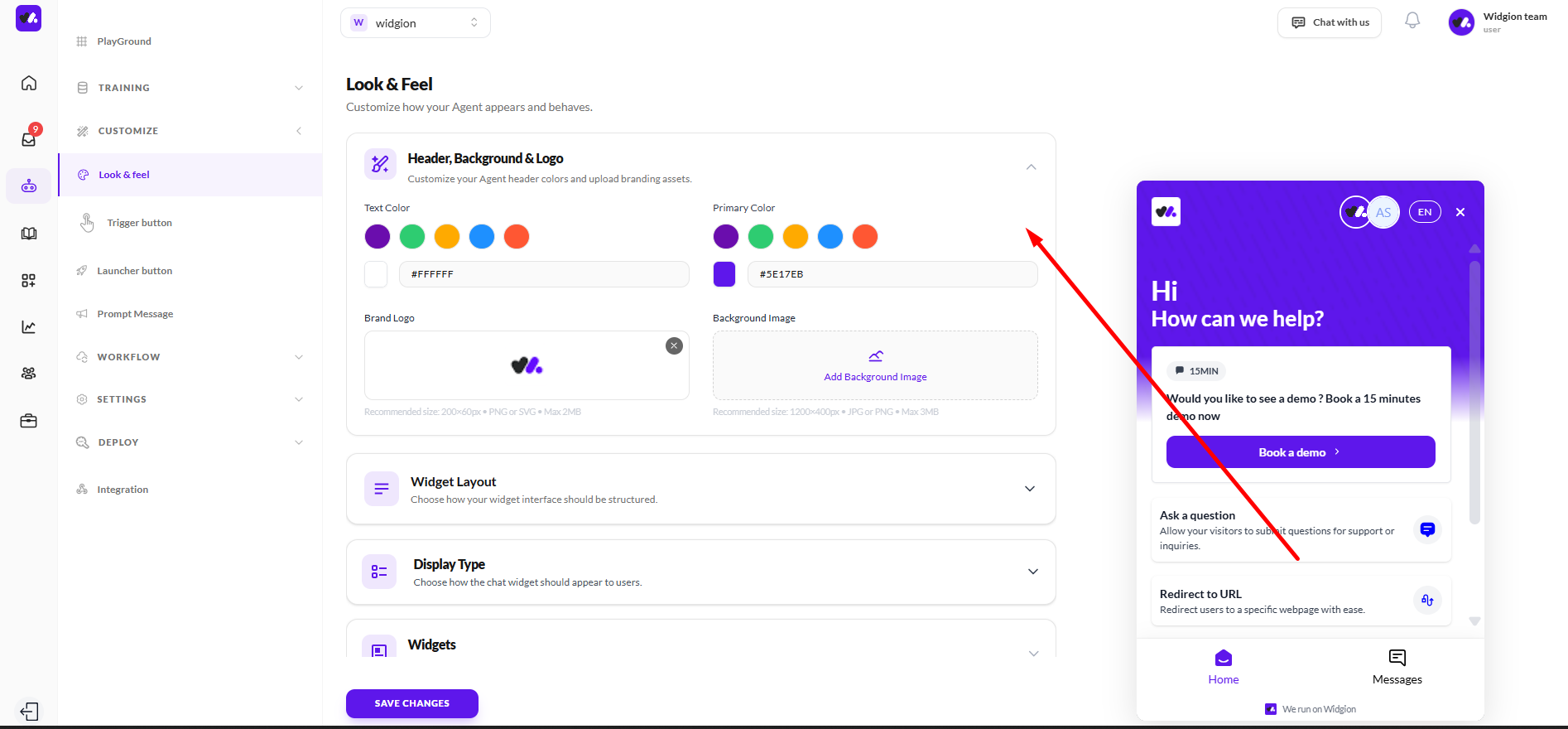
Header, Background & Logo
This section controls the visual identity of your chat widget’s header. You can set both the text color and primary color using preset options or by entering a custom hex value, allowing you to define how the header and key interface elements appear.
You can also upload your brand logo and add a background image to the header area. Recommended file sizes and formats are provided to guide you when uploading assets, helping ensure everything displays correctly.
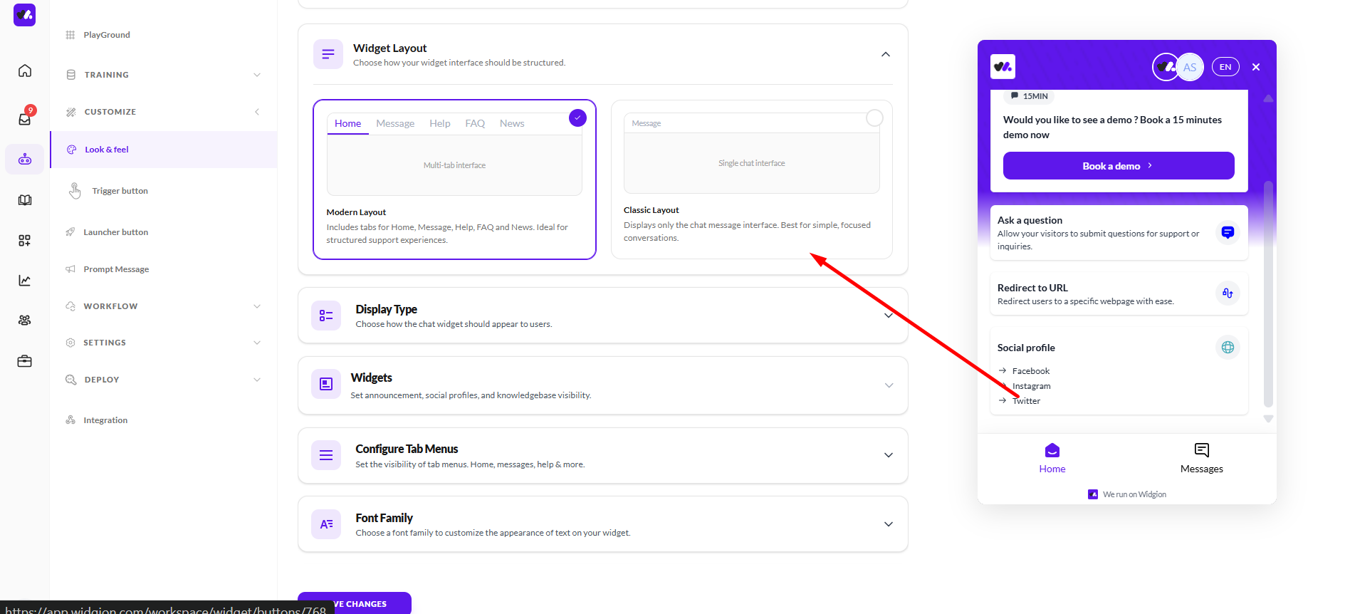
Widget Layout
This section controls how your chat interface is structured. You can choose between a Modern Layout, which includes tabs such as Home, Message, Help, FAQ, and News for a more structured experience, or a Classic Layout, which displays only the chat message interface for a simpler, more focused conversation.
The layout you select determines how users navigate and interact with your chat, either through multiple sections or a single streamlined view.
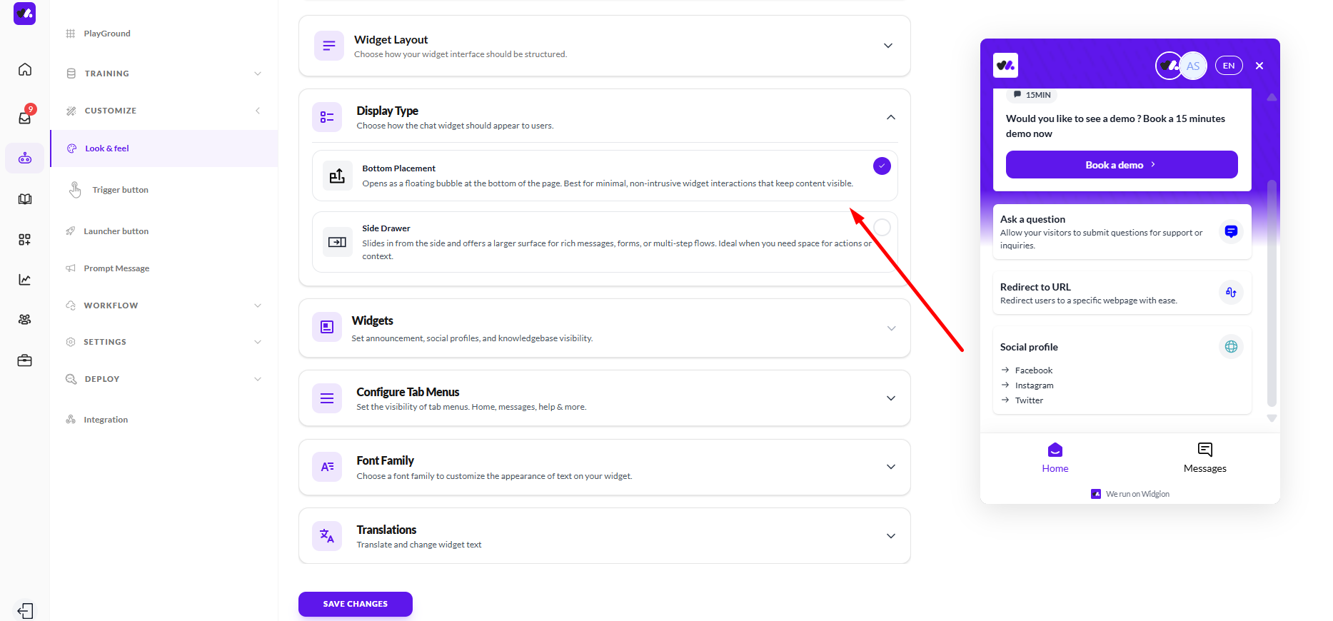
Display Type
This section controls how the chat widget appears on your website. You can choose Bottom Placement, where the chat opens as a floating bubble at the bottom of the page, or Side Drawer, where the chat slides in from the side and provides a larger interface.
The option you select determines how much space the chat occupies and how prominently it appears, allowing you to balance visibility with how much room you want the interaction to take.
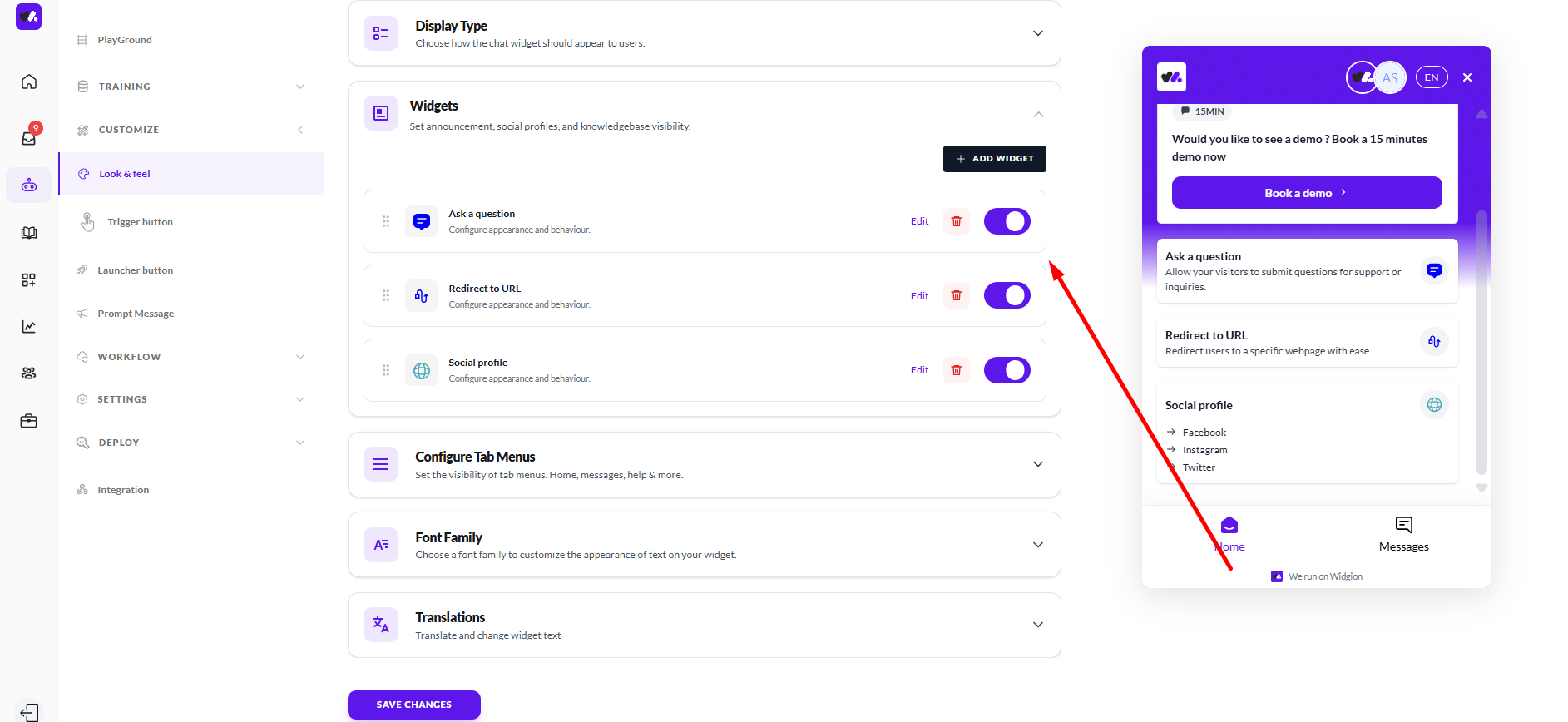
Widgets
This section allows you to manage the elements that appear inside your chat widget. You can enable or disable items such as Ask a question, Redirect to URL, and Social profile, depending on what actions you want users to have access to.
Each item can be edited to configure its appearance and behaviour, and you also have the option to add new widgets. This gives you control over what users can see and interact with within the chat interface.
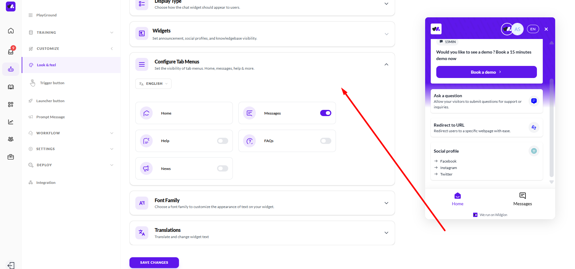
Configure Tab Menus
This section allows you to control which tabs are visible in your chat interface. You can enable or disable options such as Home, Messages, Help, FAQs, and News, depending on what you want users to access.
You can also select the language for these labels, ensuring the tab menu aligns with your preferred language and user experience.
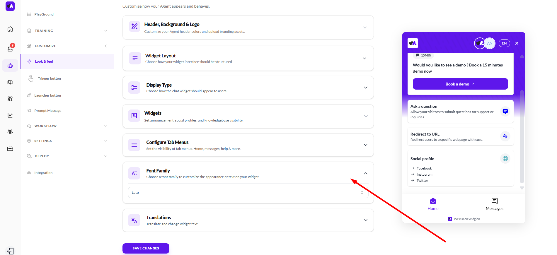
Font Family
This section allows you to customize the font used across your chat widget. You can select a font from the available options to define how text appears within the interface.
The selected font is applied consistently throughout the chat, helping you align the text style with your overall brand and visual preference.
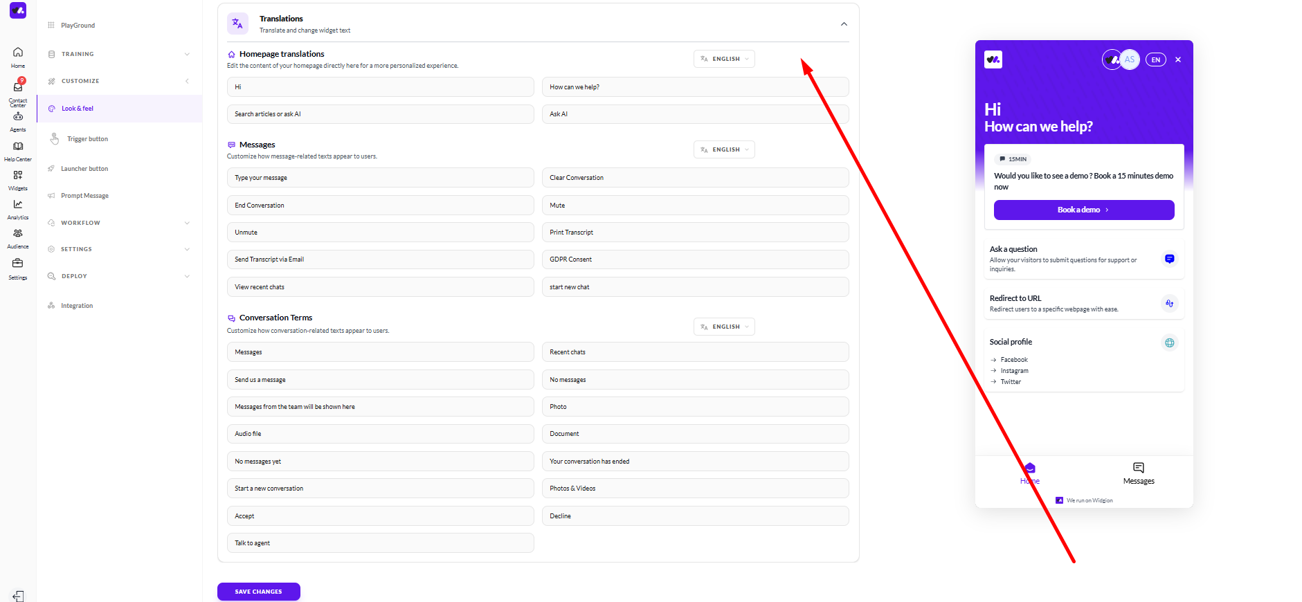
Translations
This section allows you to customize the text used across your chat widget. You can edit content within areas such as Homepage translations, Messages, and Conversation Terms, giving you control over how text appears to users.
Each section includes editable fields for different interface texts, and you can select a language to manage translations accordingly. This helps you tailor the wording of your chat experience to match your brand voice or support multiple languages.
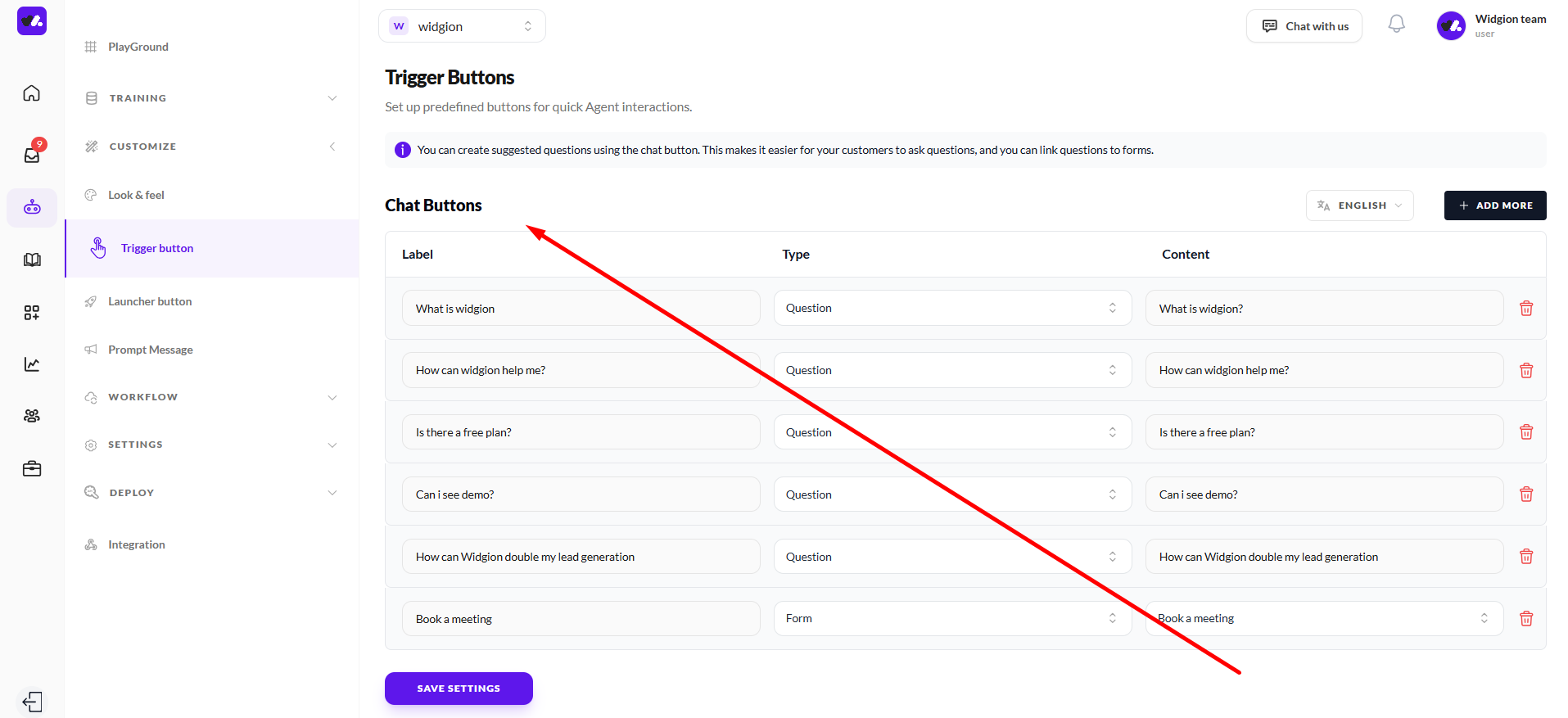
Trigger Buttons
This section allows you to set up predefined buttons for quick interactions within your chat. These buttons help users start conversations faster by providing suggested options they can select instead of typing.
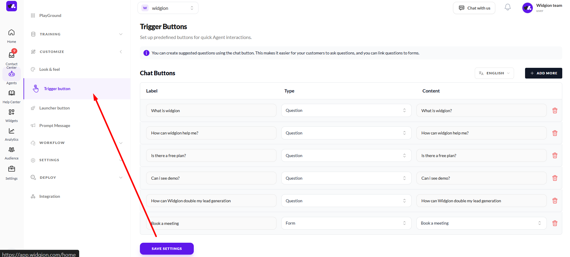
Chat Buttons
Within this section, you can create and manage individual buttons. Each button includes a label, a type (such as Question or Form), and the content that will be triggered when selected.
You can add more buttons, edit existing ones, or remove them as needed, giving you control over how users initiate interactions.
Launcher Button
This section allows you to customize the appearance and behaviour of your chat launcher button. It controls how the button looks, where it is positioned, and how it interacts with users on your website.
You can adjust elements such as position, style, icon, spacing, and animation to ensure the launcher fits seamlessly into your interface and remains easily accessible to users.
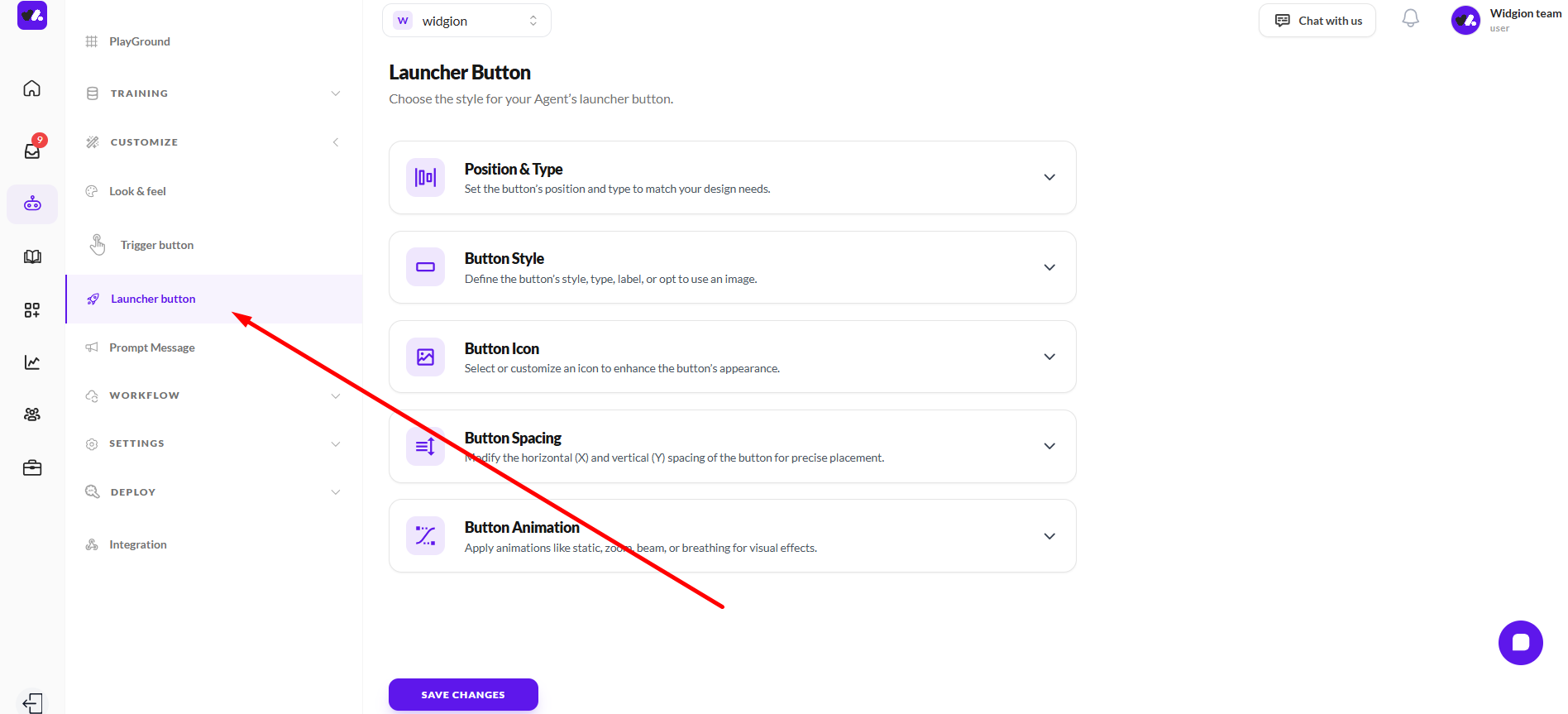
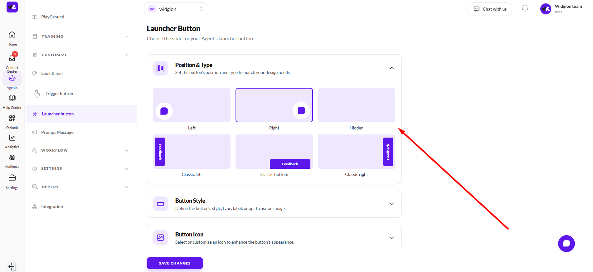
Position & Type
This section allows you to control where the launcher button appears on your website and how it is displayed. You can position the button on the left, right, or hide it completely, depending on your preference.
You can also choose from different placement styles, including classic left, classic bottom, and classic right, giving you flexibility in how the button is presented and accessed by users.
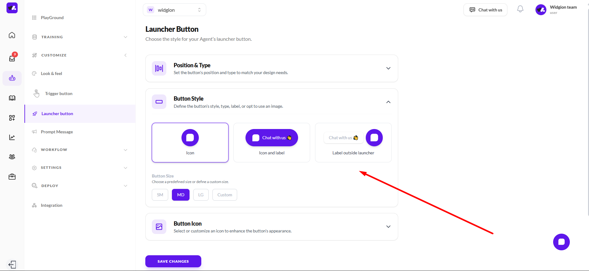
Button Style
This section allows you to define how the launcher button appears. You can choose between an icon only, icon and label, or label outside launcher, depending on how visible and descriptive you want the button to be.
You can also select a button size from the available options (SM, MD, LG, or Custom), giving you control over how prominent the launcher appears on your interface.
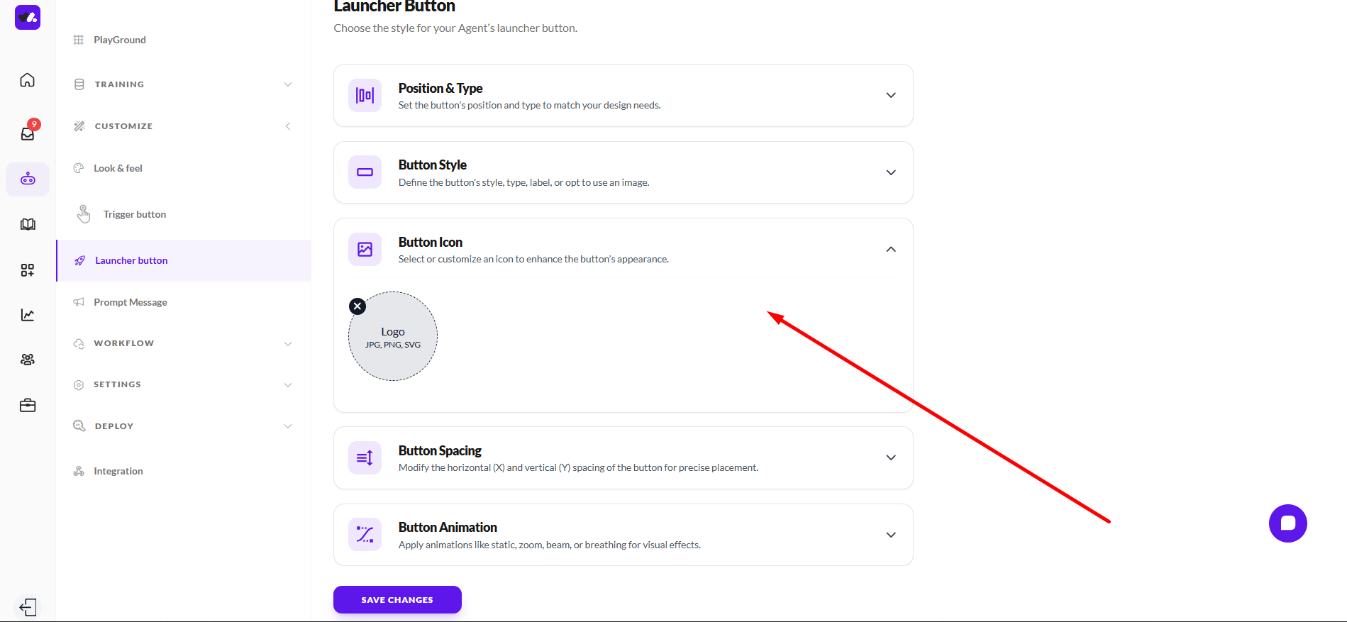
Button Icon
This section allows you to customize the icon used for your launcher button. You can upload your own icon or logo in supported formats such as JPG, PNG, or SVG, giving you flexibility to match your brand identity.
Using a custom icon helps make your launcher instantly recognizable while maintaining visual consistency with the rest of your interface.
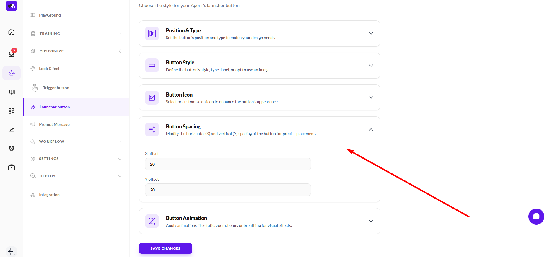
Button Spacing
This section allows you to control the exact placement of your launcher button on the screen. You can adjust the horizontal (X offset) and vertical (Y offset) values to fine-tune where the button appears.
By modifying these spacing values, you can ensure the launcher fits perfectly within your layout, avoids overlapping important elements, and aligns with your overall design structure.
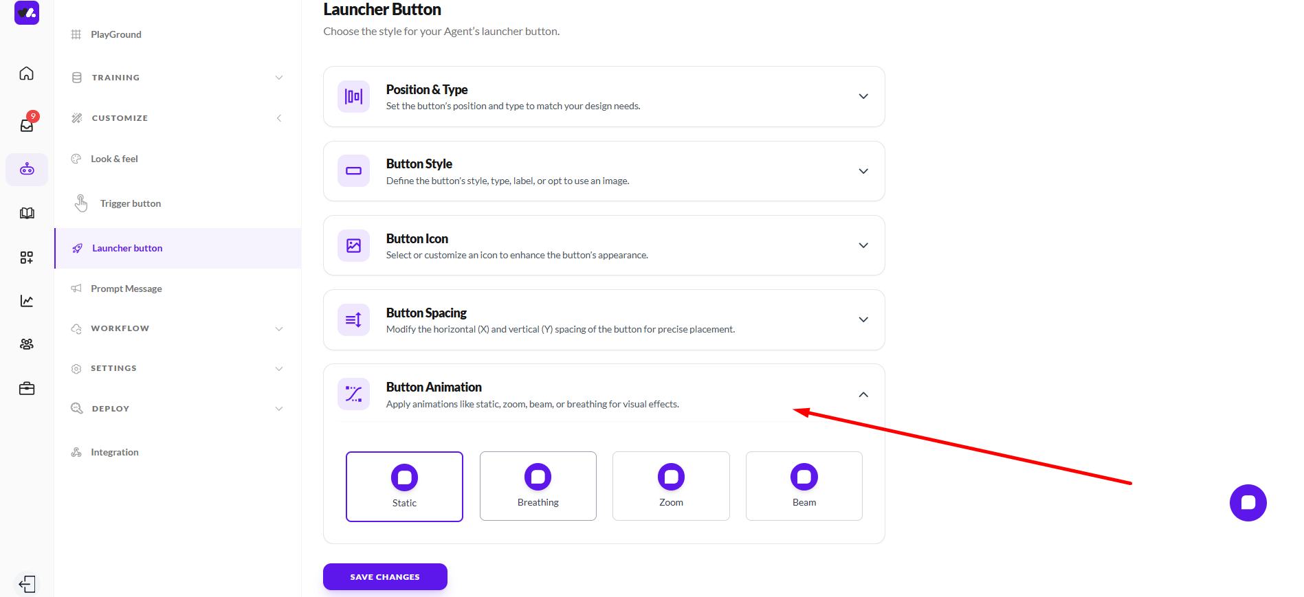
Button Animation
This section allows you to control how the launcher button behaves visually. You can choose from different animation styles such as Static, Breathing, Zoom, and Beam, depending on how subtle or attention-grabbing you want the button to be.
Animations can help draw user attention to the launcher and encourage interaction, while still allowing you to maintain a balance between visibility and a non-intrusive experience.
Prompt Messages
The Prompt Messages section allows you to control how your assistant initiates and guides conversations with users. It helps you create proactive messages that appear to visitors, encouraging engagement and directing them toward relevant actions or questions.
Through this section, you can enable prompts, define when and how they appear, and customize the messages themselves. This ensures your assistant doesn’t just respond, but actively supports users by starting conversations, offering guidance, and improving overall interaction flow.
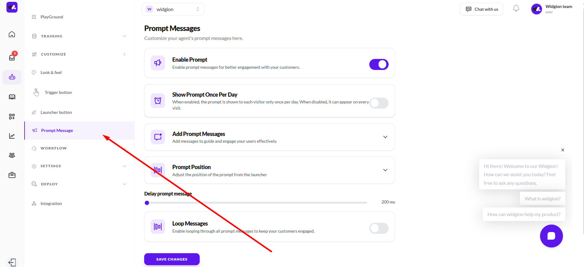
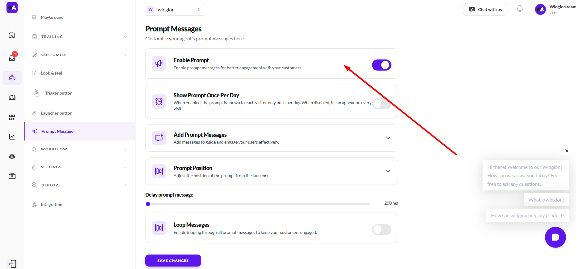
Enable Prompt
This setting allows you to turn prompt messages on or off. When enabled, your assistant can proactively display messages to engage users, guide interactions, and encourage conversations.
Disabling this option stops all prompt messages from appearing, meaning your assistant will only respond when users initiate a conversation.
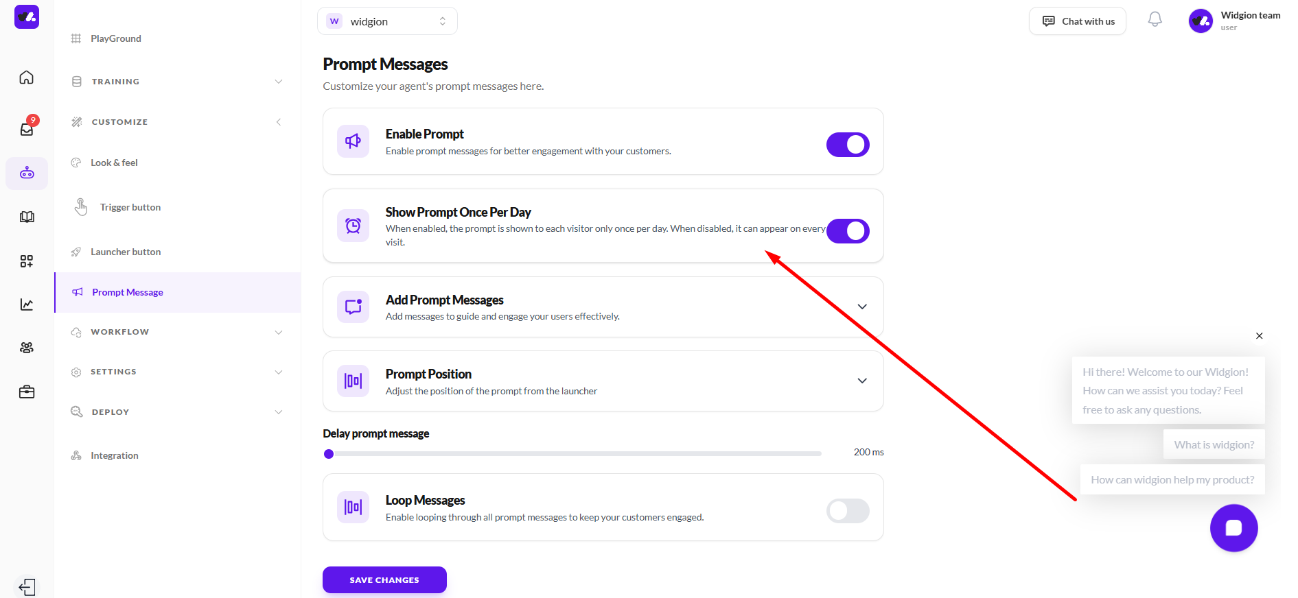
Show Prompt Once Per Day
This setting controls how often prompt messages are shown to each visitor. When enabled, a user will only see your prompt once per day, helping prevent repeated interruptions.
When disabled, the prompt can appear on every visit, making it more frequent and visible. This is useful when you want to maximize engagement, but should be used carefully to avoid overwhelming users.
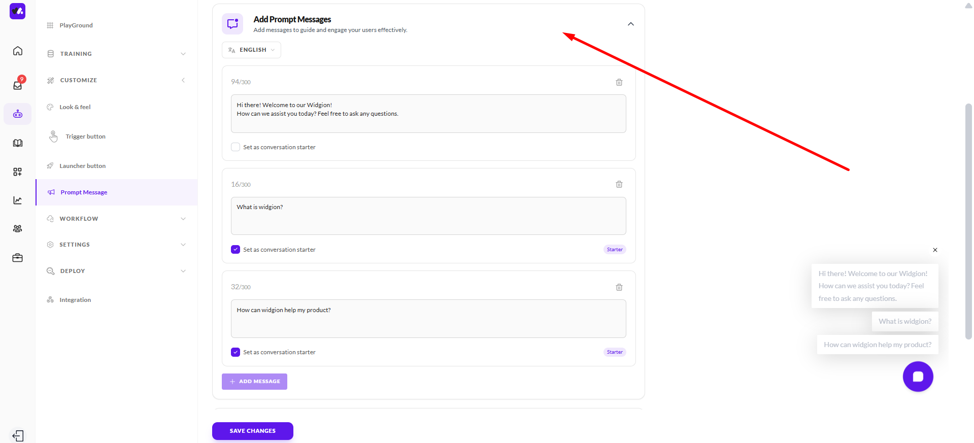
Add Prompt Messages
This section allows you to create and manage the messages your assistant shows to users. You can add multiple prompts, each with its own content, helping guide users toward common questions or actions.
Each message has a character limit and can be set as a conversation starter, allowing it to appear as a quick, clickable option. You can also organize, edit, or remove messages as needed, giving you full control over how your assistant initiates and supports conversations.
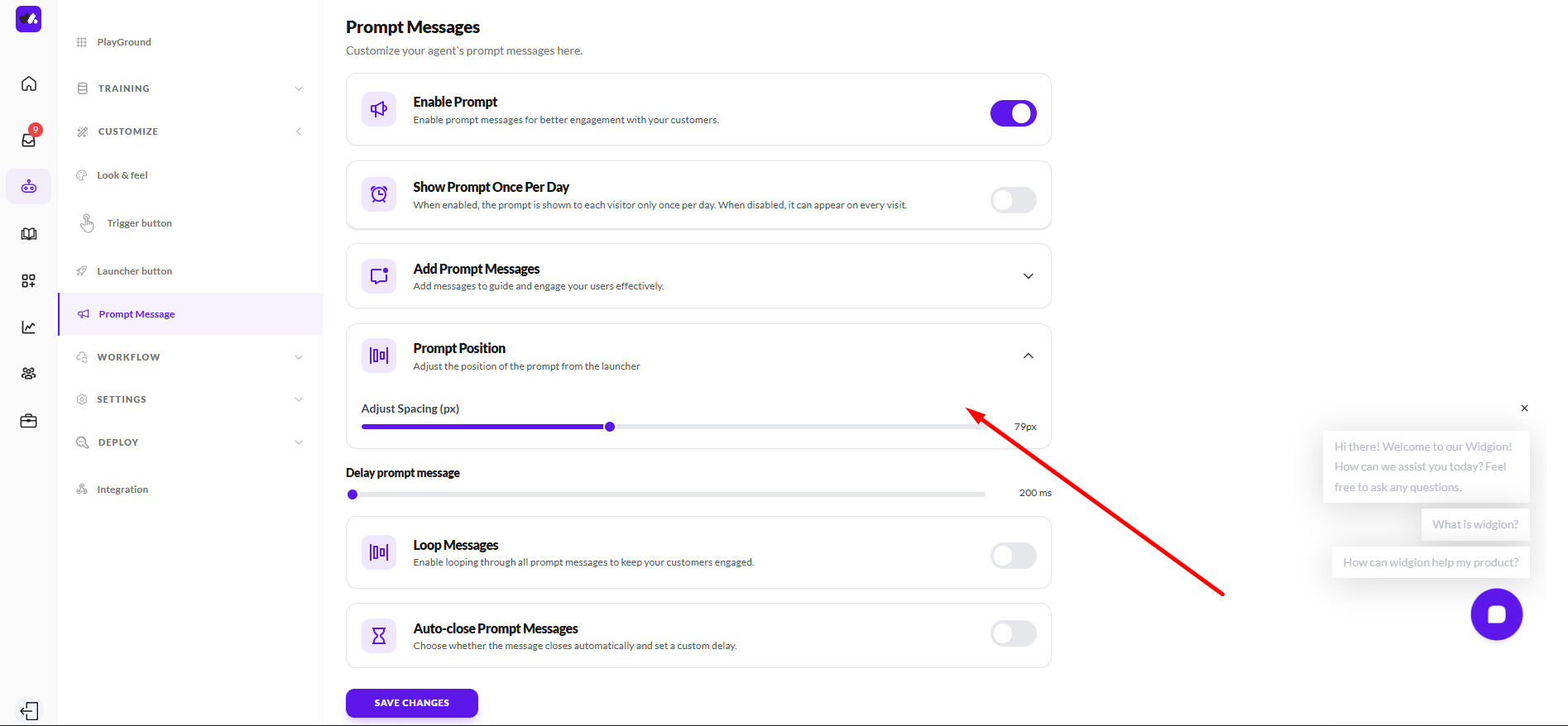
Prompt Position
This section allows you to control where prompt messages appear in relation to the launcher button. You can adjust the spacing using the slider to position the prompt closer to or further away from the launcher.
Fine-tuning this placement helps ensure your prompts are clearly visible without overlapping other interface elements, creating a cleaner and more intentional user experience.
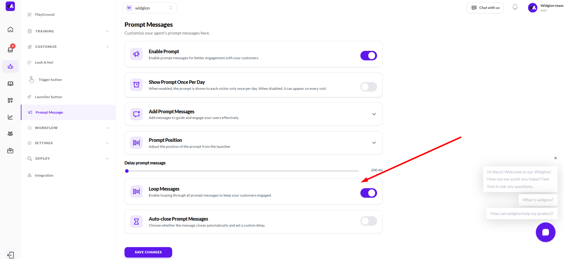
Loop Messages
This setting allows your prompt messages to cycle continuously. When enabled, your assistant will loop through all available prompt messages, keeping the interaction dynamic and consistently visible to users.
This is useful for maintaining engagement, especially when you have multiple prompts you want users to notice over time. When disabled, prompts will appear only once without repeating.
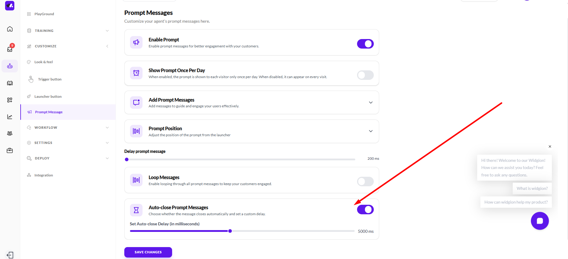
Auto-close Prompt Messages
This setting allows you to control whether prompt messages close automatically after a set period. When enabled, prompts will disappear on their own, helping keep the interface clean and non-intrusive.
You can also define a custom delay (in milliseconds) to determine how long the prompt remains visible before closing. This gives you flexibility to balance visibility with a smooth user experience.
Bringing It All Together
Customizing your chat experience in Widgion allows you to shape how your assistant looks, behaves, and engages with users. From visual elements like layout and branding to interaction controls like buttons and prompt messages, each setting works together to create a seamless and consistent experience.
By thoughtfully configuring these options, you ensure your assistant not only reflects your brand but also supports users effectively guiding conversations, improving engagement, and delivering a more intuitive support experience over time.
Did this answer your question?
0 Likes
0 Unlikes